
Trending Fruit Pottery Painting Designs
Updated: Oct 8, 2025
Fruit-themed designs have become a vibrant and popular choice for pottery painting, captivating people of all ages with their bright colours and appealing forms. From juicy strawberries and cheerful lemons to exotic pineapples and ripe apples, these motifs bring a fresh and lively aesthetic to ceramic pieces. Painting fruit on pottery offers endless creativity, allowing painters to experiment with bold colour palettes and intricate details.
This trend not only celebrates nature's bounty but also infuses everyday items with a splash of joy and artistic flair.


When Life Gives You Lemons...
When life gives you lemons... Paint them on pottery! One of the most popular designs that we always see getting painted is citruses, whether it's lemons, oranges or limes these always come out the kiln looking really effective.
Our top tip: Use a paint pen in white to get the highlights in each segment of the citrus.

Just Peachy!
Another popular design is peaches! This design has been a common occurrence since a few Tiktoks of people painting it went viral!
Our top tip: Use a Cricut to cut out peach shaped stickers to put on your piece whilst you paint the background. This will leave the space free when you peel them off so that you are left with a stencil. If you don't have a cricut you can use a wet paper stencil over a base layer of white paint to get the same effect.
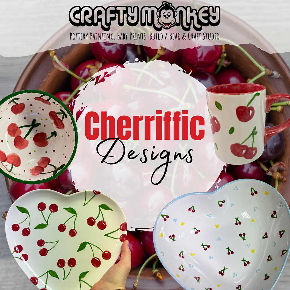
Cherriffic Designs
This design looks really effective and we're seeing it being painted in the studio more and more. This plate gives us major picnic vibes and is the perfect design to paint on a date.
Our top tip: Use a paint pen in green to do the stalks, you can also use a paint pen in white to add a highlight to the cherry.
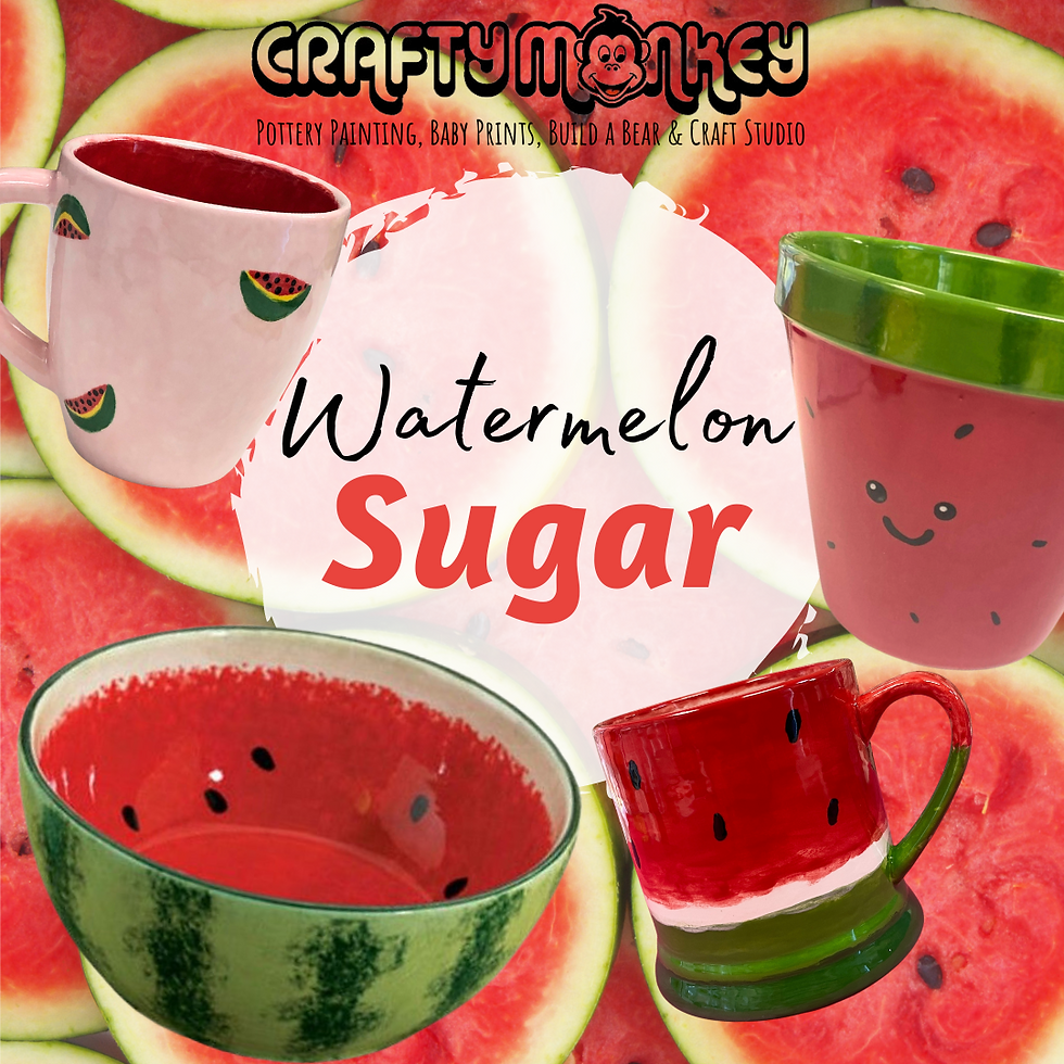
Watermelon Sugar
A lot of the popularity of fruit designs have come from Harry Styles. With his songs named Cherry, Watermelon Sugar, and Kiwi as well as lyrics mentioning Strawberries, you can see why fans are wanting to paint fruit pottery inspired by him. This design makes a great handmade gift for a Harry Styles fan. Stay tuned for a Harry Styles themed pottery night.
Our top tip: Use the end of a paintbrush to create a dot then flick it out to create a seed shape.

Squeeze The Day
Another popular citrus design is oranges. Whether whole or just the segments, we are seeing this design getting painted in the studio more and more! This design is perfect for a hot summer's day!
Our top tip: use a sponge dabber to create oranges easier, then you can paint on highlights and leaves using a paint pen.

The Kiwi To Our Heart
This is one of the more underrated fruit designs but we are seeing it become more and more popular. This is another design that is perfect for Harry Styles fans, why not add some lyrics to customise it further!
Our top tip: Use the end of a paintbrush to create a dot then flick it out to create a seed shape.

Sub-Lime
Another citrus design, this time it's limes! These are a popular choice to pair with lemons on a piece.
Our top tip: When creating a lime plate or bowl you can use your fingerprint to create texture in the segments.

Berry Sweet
Strawberries are the perfect fruit for a picnic, which also make them the perfect fruit to paint on pottery!
Our top tip: Use a heart plate and paint a strawberry using the shape of the plate as a guide.

Have a Grape Day
Our final design to talk about is Grapes. This design looks great on a bowl and can then be used to keep your grapes in, or why not mix and match a few of these designs to create your new fruit bowl!
Our top tip: Plan out where each of your grapes will go with a felt tip first, felt tips will burn off in the kiln, you can then use a sponge dapper or your fingerprint to add each of the grapes on with paint.
If you've felt inspired by any of these designs why not, book a pottery painting session or buy a take out kit. Also keep an eye on our social media feed for more inspiration and for details of when we run our next fruit themed workshops.
Don't forget to comment and let us know which of these was your favourite design.


I have been checking out different gaming platforms recently, and usability has become one of the first things I notice. A website should make basic navigation feel natural instead of forcing visitors through multiple pages. I appreciate clear categories, visible buttons, and properly arranged information. Mobile compatibility is another important factor because phones are convenient for quick browsing. When everything loads properly and the layout stays organized, the platform becomes much easier to explore.
ganga club login
hi88 nhìn chung làm mình nhớ mấy nền tảng mình từng xài hồi trước, kiểu vào cái là thấy chia khu vực tương đối rõ ràng nên đỡ phải đoán xem cái gì nằm ở đâu. Mình lướt trên điện thoại nên hay để ý thanh menu với cách họ gom nội dung, và ở đây chuyển qua lại mấy mục khá nhanh, không phải kéo lên kéo xuống nhiều (mình hơi khó tính vụ này). Nội dung cũng trình bày theo dạng khối ô nhìn gọn, đọc lướt vẫn nắm được ý chính chứ không cần bấm sâu mới thấy thông tin. Có một điểm mình thấy ổn là phần thông tin kèo với trận đấu cập nhật liên…
These fruit pottery designs are so charming! I especially love the idea of painting peaches using a Cricut for a stencil effect; it sounds like a fun way to add a personal touch. I used to dabble in pottery during my college days, and now I’m inspired to explore this trend further. I might even try generating some fun miniature images of my pottery pieces with a tool I found recently. You can create unique art inspired by your designs at AI Miniature Generator. Can't wait to see what I can create!
xoilac thì đúng là kiểu đang nói dở câu nãy giờ, mình cũng vừa mở lại lúc nghỉ giữa hiệp để xem có dễ dùng không. Mình dùng điện thoại nên chỉ quan tâm mấy thứ cơ bản: vào là thấy ngay trận đang chiếu và mấy trận sắp tới, không phải mò quá sâu hay lướt mệt, nhìn qua là biết bấm chỗ nào. Chữ nghĩa trên trang cũng vừa đủ, không nhồi nhét, nên chuyển qua lại giữa các mục vẫn nhanh. Mình coi thử vài phút thôi, hình với tiếng ổn, không bị đứng hình liên tục như mấy trang mình hay gặp. Nói chung không có gì “làm màu”, kiểu làm cho người xem tìm trận…
https://o8.social/ mình ghé thử cho biết vì thấy bạn bè nói qua, kiểu vào xem giao diện có dễ dùng không thôi. Lướt một vòng thấy trang chia nội dung theo từng khối khá rõ, nhìn cái là biết mình đang ở phần nào chứ không bị dính một cục chữ dài. Mình cũng chú ý họ có nhắc chuyện có 1 trang chính kèm vài link dự phòng để vào cho ổn định, nghe cũng hợp lý vì nhiều web dạo này hay chập chờn theo mạng. Menu để ngay chỗ dễ thấy nên chuyển qua lại nhanh, không cần mò. Nói chung cảm giác đọc thông tin nhẹ đầu, tiêu đề và khung nội dung canh gọn nên…